פרויקט הגמר שלי עסק במיתוג למוצרי היגיינה נשיים שמתייחס לקהל של נערות מתבגרות. הטריגר שהוביל ליצירת הפרויקט היה הפער האדיר שקיים בין המוצרים הקיימים היום בשוק לבין האופי של הנערות המתבגרות של היום: מצד אחד המוצרים האלה מלמדים אותן ואותנו כחברה שמחזור ווסת הם תהליכים שצריך להתבייש בהם, להסתיר, וכי מדובר בהליכים רפואיים וקרים. לעומת זאת, הנערות המתבגרות של היום מלאות בביטחון עצמי, הן דעתניות, לא מתביישות, וחשופות להמון תכנים ומסרים של העצמה נשית כבר מגיל צעיר.
My final project was branding feminine hygiene products, with focusing on the audience of young teenage girls. The trigger that lead me to create this project was the massive gap which exist between the current products in the feminine hygiene market to the teenage girls of this era: On the one hand, these products teach them and us as a society, that menstrual cycles are processes to be ashamed of, to hide and that these are "cold", medical procedures. By contrast, today's teenage girls, are full of self-confidence, knowledgeable and exposed from a young age to a lot of content of female empowerment.
אחת השאלות המרכזיות שהובילו אותי בפרויקט הייתה האם עיצוב יכול לשנות גישה, תפיסה, או מחשבה של חברה כלפי נושא מסוים. כשצללתי לעומק של גיל ההתבגרות הבנתי שזה גיל מאוד סוער, מלא בחוסר ודאות, וגם פחדים. זה גיל שבו אותן נערות נחשפות לשיח חדש עם הגוף שלהן, וגם לסוגים נוספים של שיחות: בינם לבין עצמן, בינן לבין נערות נוספות, בינן לבין בני משפחה, ובינן לבין המוצרים בהן הן משתמשות.
החלטתי להשתמש בשיחות הללו וליצור להן משמעות שבאה לידי ביטוי באריזות. הגישה של המותג bloody awesome מגיעה נקודת המבט של החברה הטובה. מצד אחד היא בגילי, והיא יודעת מה עובר עליי, אני יכולה לשאול אותה את כל השאלות הכי מביכות שיש, ומצד שני יש לה אינפורמציה שאני יכולה לסמוך עליה.
One of the key questions that led me to this project, was whether design could change perception, or a company's thought to a curtain subject. When I dived into the depths of adolescence, I realized it was a very turbulent age filled with uncertainty and fears. It's an age when these girls are exposed to a new dialogue with their bodies and other types of dialogues: Between them and other girls, between them and family members, and between them and the products they shop.
I decided to use these dialogues and create meaning for them that is reflected in the packaging. The "Bloody awesome" brand's approach, reaching from the point of view of the best friends. On the one hand, she is in my age and she knows what I am going through. I can ask her all the most embarrassing questions. On the other hand, she has information I can trust and rely on.
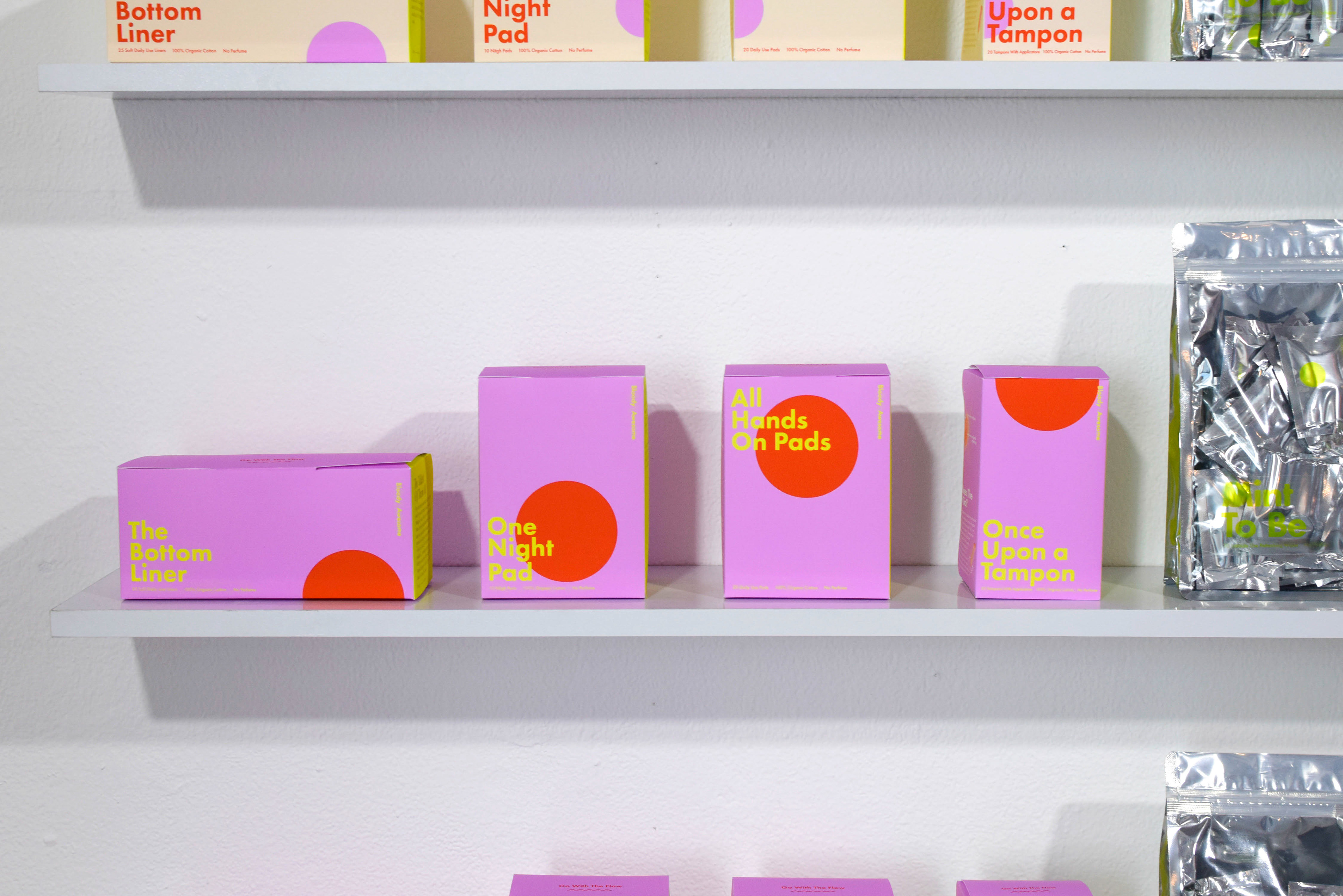
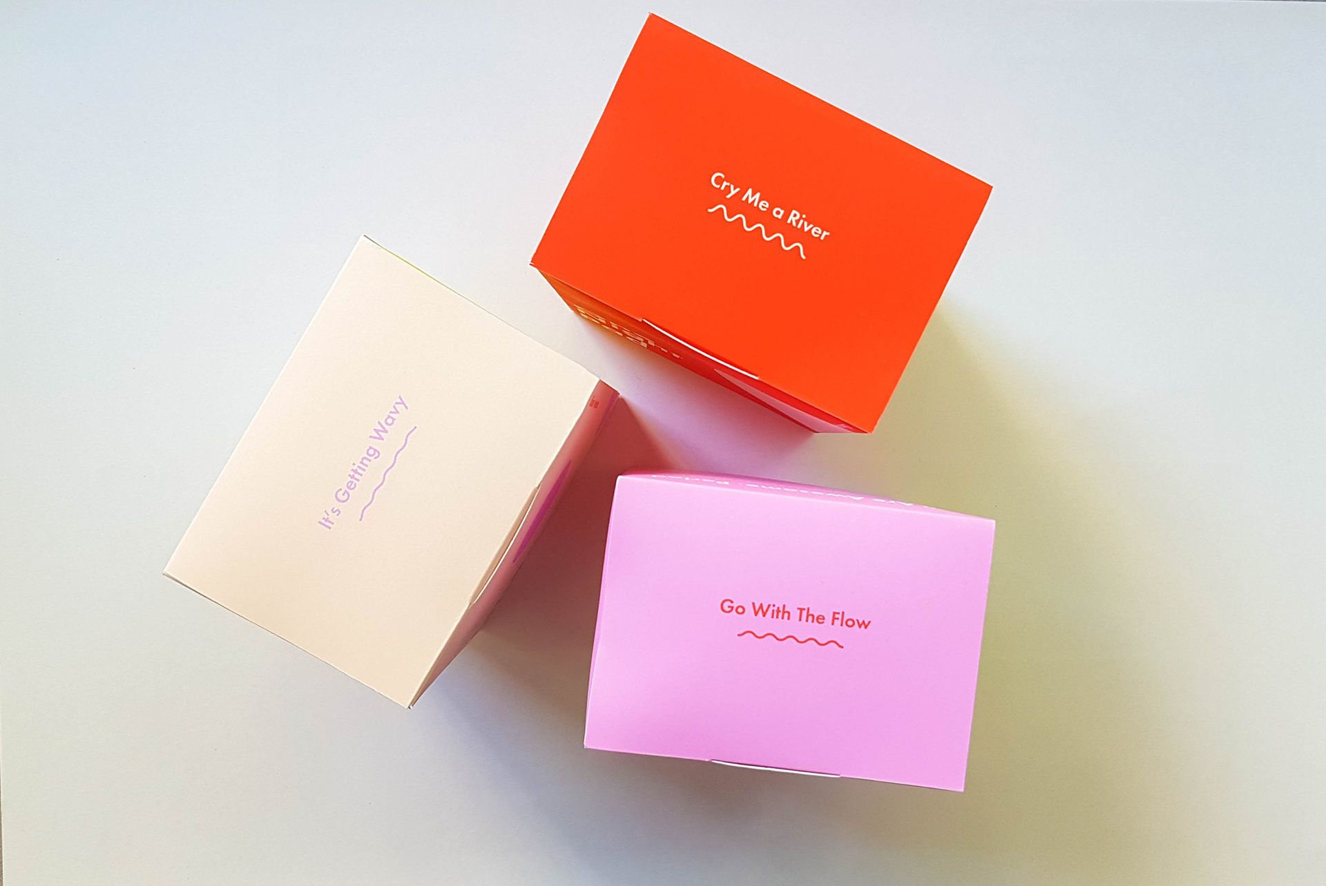
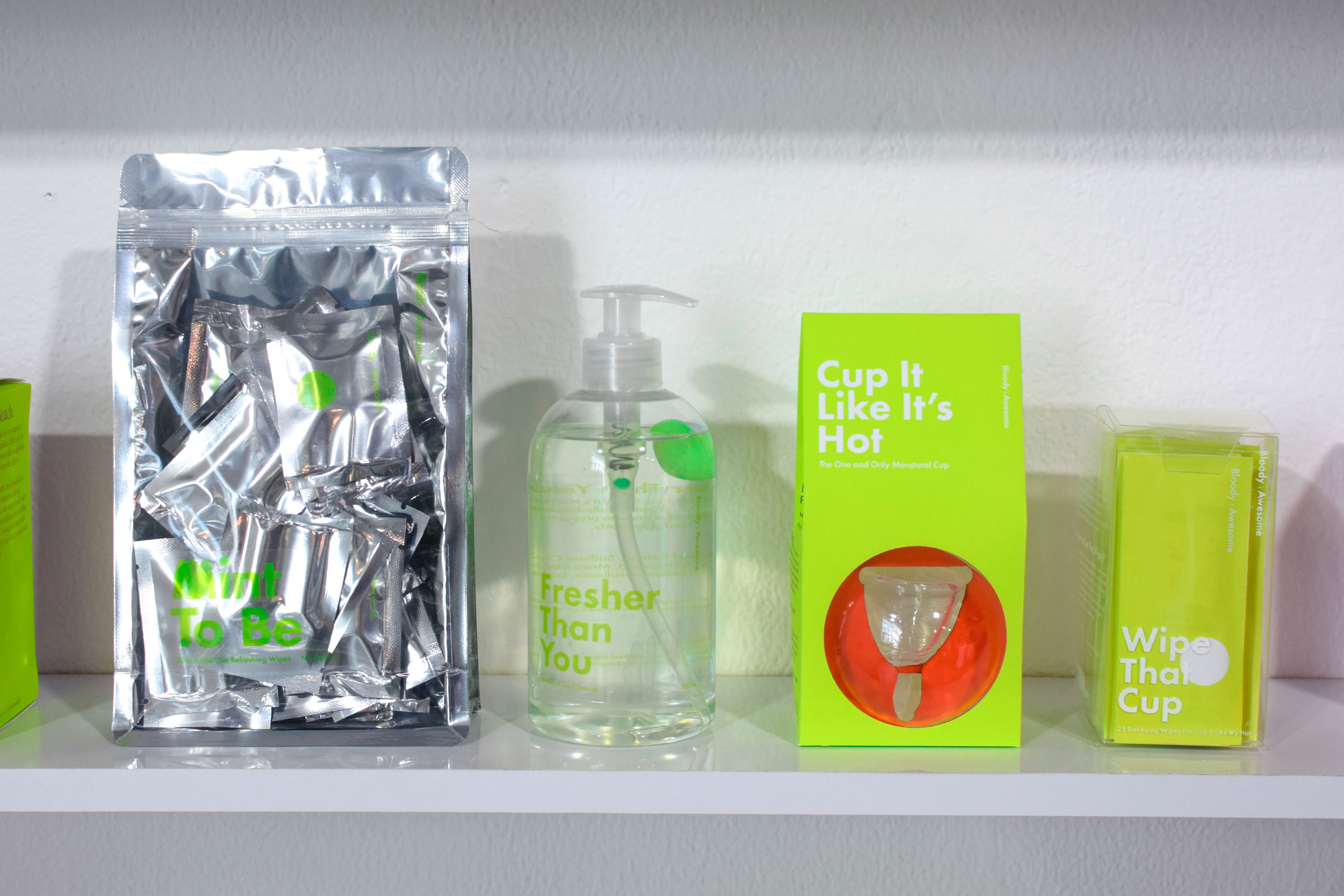
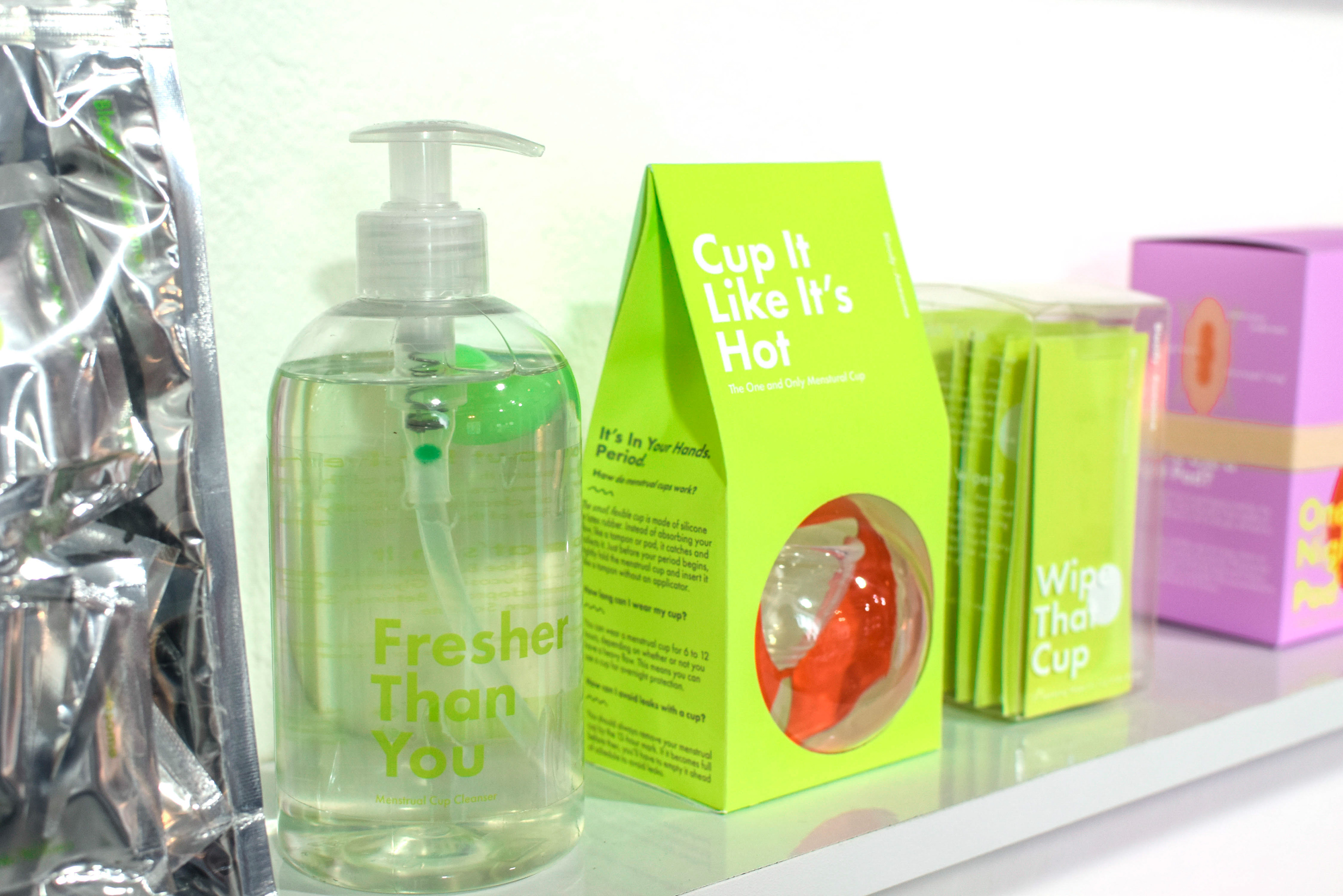
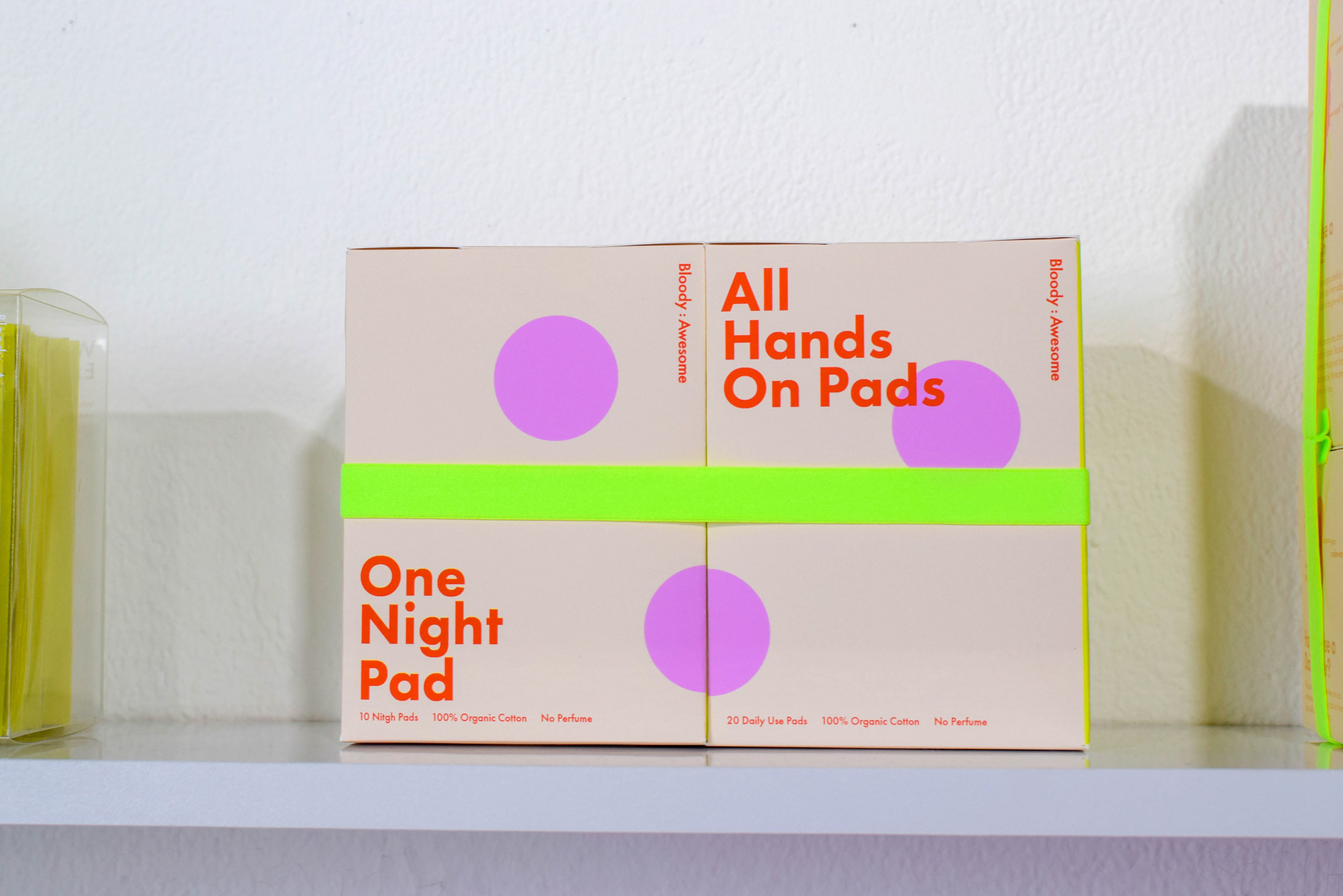
בחזית הראשית מופיע שם המוצר בשילוב קופי כדי לגשת לנושא בהומור וקלילות.
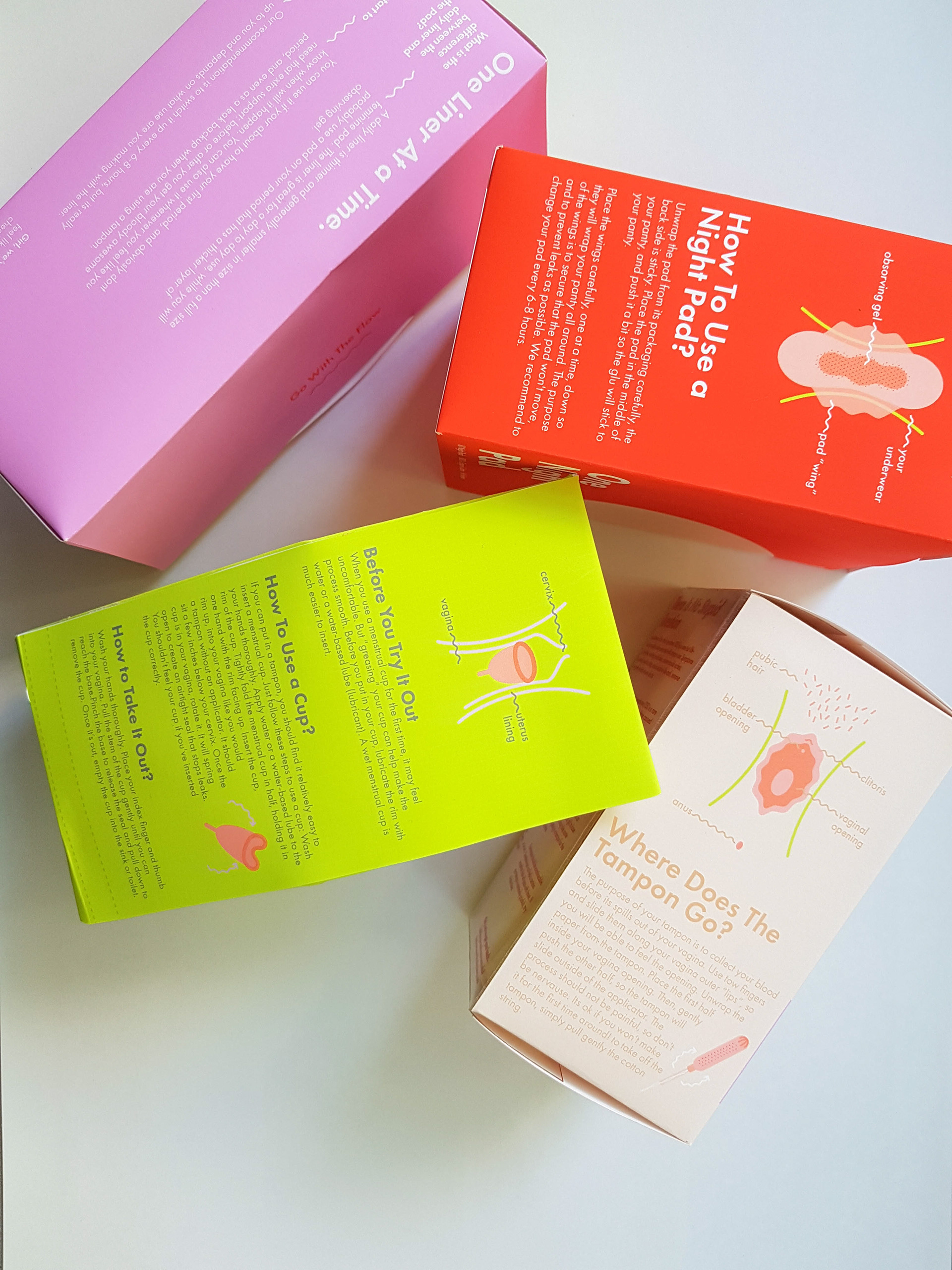
ברגע שמסובבים את האריזה הדבר הראשון שנחשפים אליו הוא סיפור אישי של נערה מתבגרת. המטרה היא להכניס אותן למוצר שעד עכשיו היה זר לחלוטין עבורן, מנקודת מבט אישית ונטולת שיפוטיות. הסיפור מתייחס למוצר עליו הוא כתוב, בהתאם לכרונולוגיה של השימוש בו, למשל: תחבושות זה המוצר הראשון בו הן משתמשות כשהן מקבלות מחזור. על גבי אריזות התחבושות יופיעו סיפורים שקשורים במחזור הראשון.
The main front of the packaging shows the product name combined with a funny copywriting, to approach the subject with humor and lightness.
Once you turn the packaging around, the first thing you are exposed to is a teenage girl's personal story. The goal is to expose them to a product that has been completely unfamiliar to them from a personal, non-judgmental point of view. The story refers to the product on which it is written, according to the chronology of its use, for example: pads are the first product the girls use when they get their first period. On the pad's packs will feature stories related to the first period.
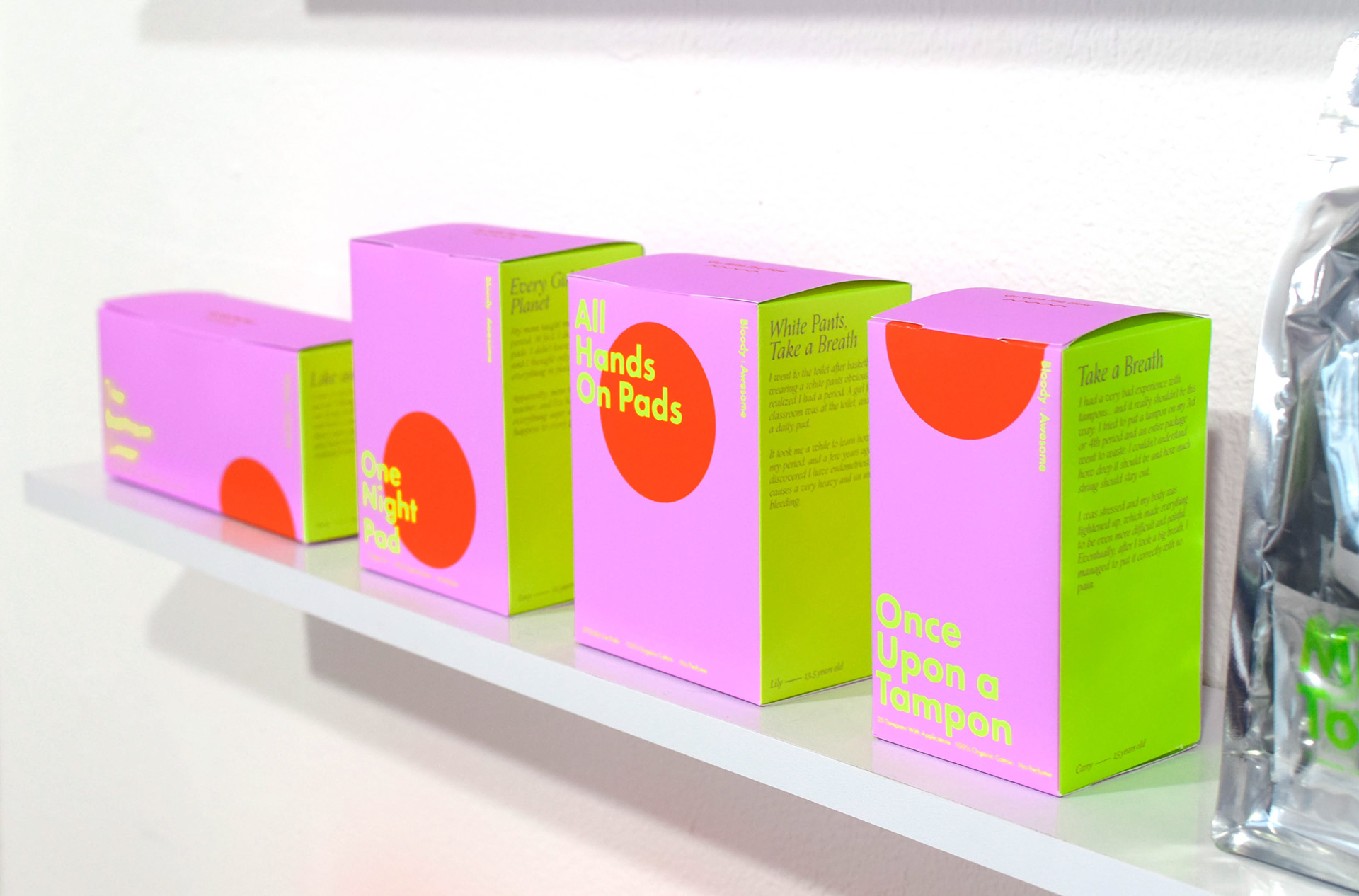
החזית הבאה- שאלות ותשובות, הזויות ככל שיהיו. השאלות והתשובות מתחלפות על גבי האריזות, ממש כמו הסיפורים- בשביל לחשוף את הנערות למידע חדש בכל פעם. הן קונות את המוצרים האלה שוב ושוב ושוב ואין סיבה שהן לא ילמדו עוד על עצמן ועל הגוף שלהן מתוך האריזות.
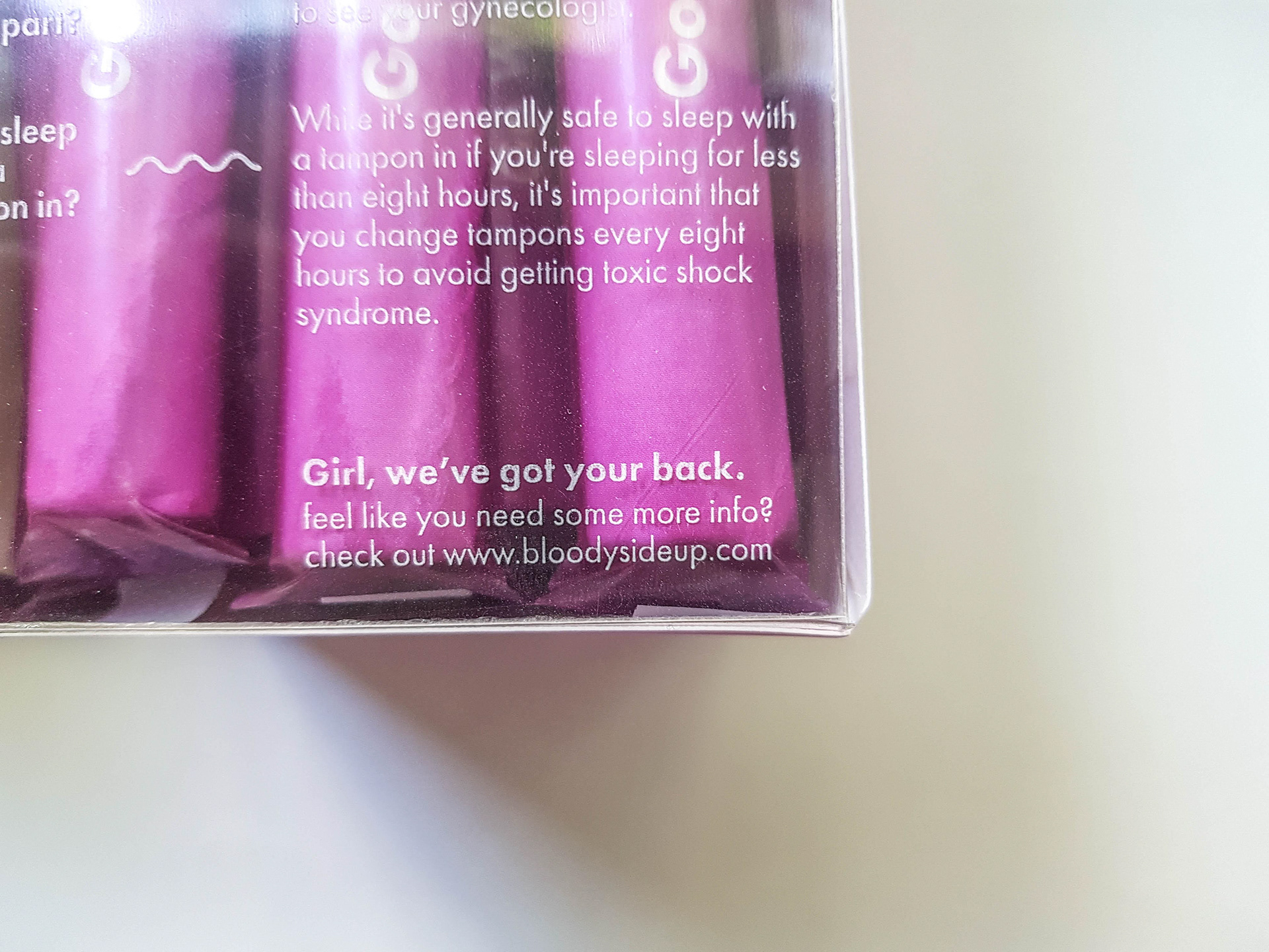
בחלק האחרון- המידע הפרקטי, איך משתמשים במוצר.
The Next front: questions and answers are as delusional as they may be. The Q&A changes on the packaging just like the stories - to expose the girls to new information. They buy these products over and repeatedly and there is no reason why they should not learn more about themselves and their bodies from of the packaging itself.
In the final part, the practical information about how to use the product.
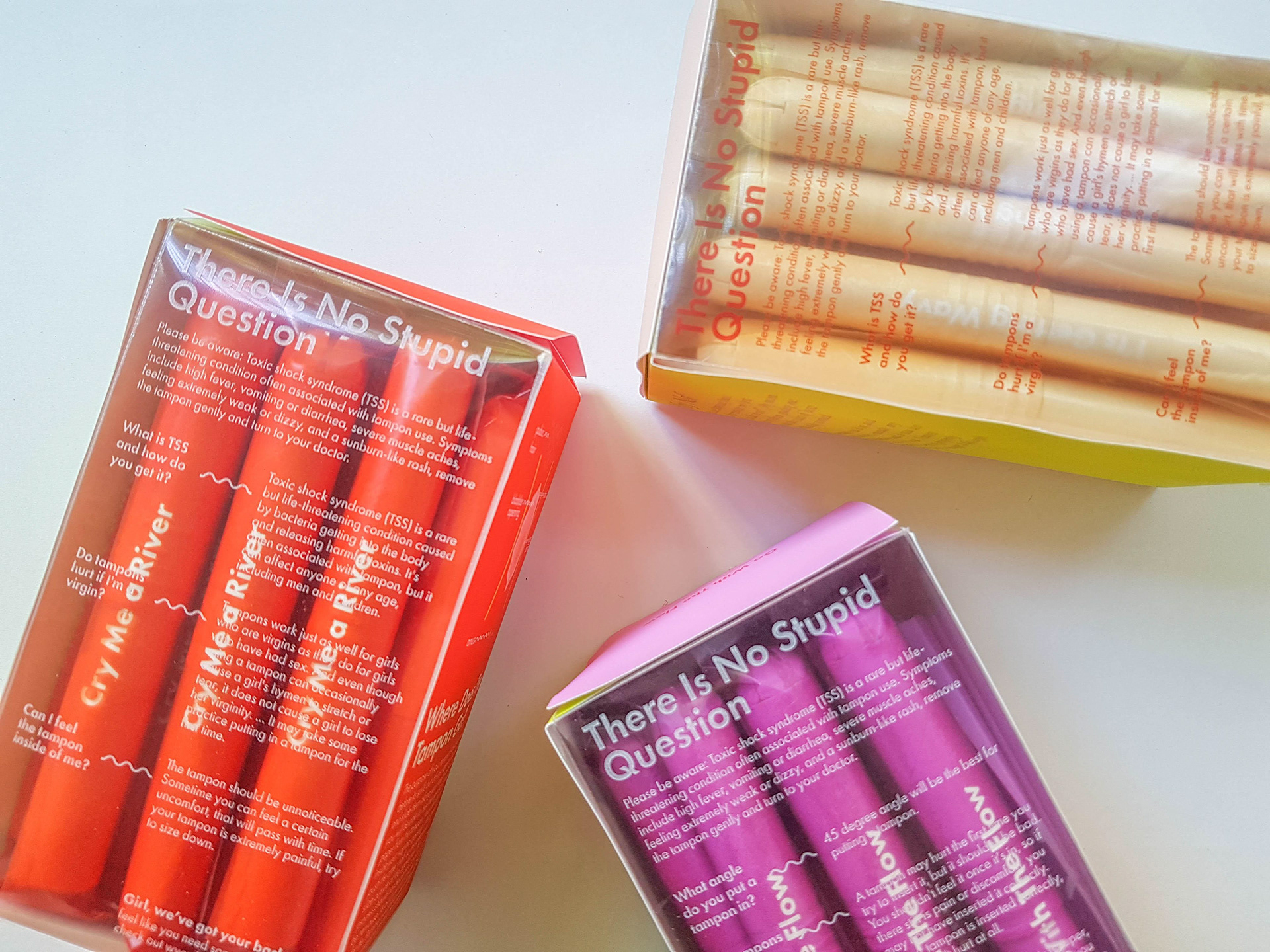
במוצרים שהשימוש בהם הוא פנימי הוספתי אלמנט של שקיפות- משיחות שלי עם הבנות הבנתי שהן מאוד מאוימות מסוג מוצרים כזה והיה צורך להראות להן את המוצר בצורתו ובגודלו הטבעי, ולא רק כאיור מוקטן על גבי האריזה.
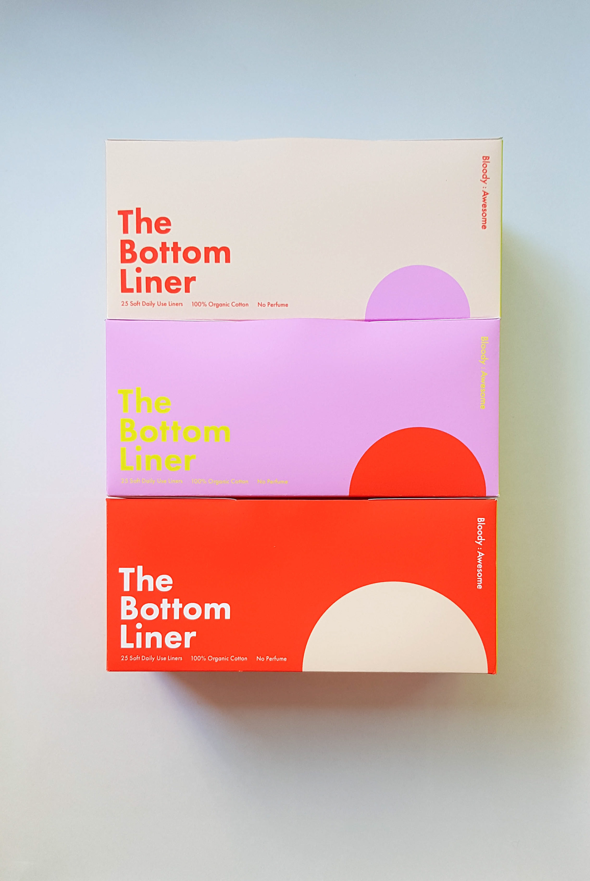
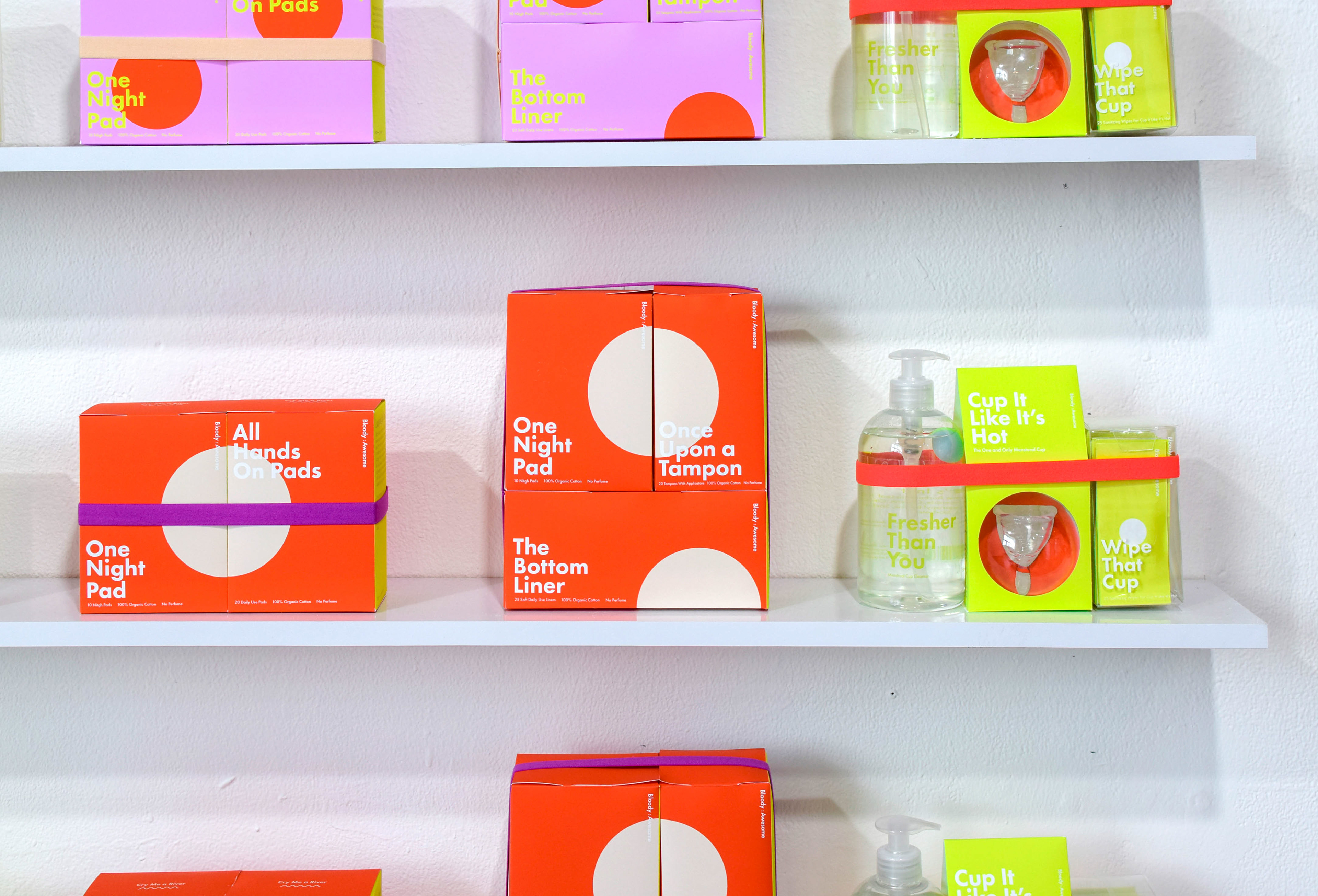
על המכסה של כל אריזה יש ייצוג לרמת הספיגה. מצד אחד היה חשוב לי להתייחס לעובדה שאכן מדובר בזרימה, ולא טיפות קטנטנות, ומצד שני, לגרום לנושא לעבור בצורה נעימה עם קריצה של הומור באמצעות קופי.
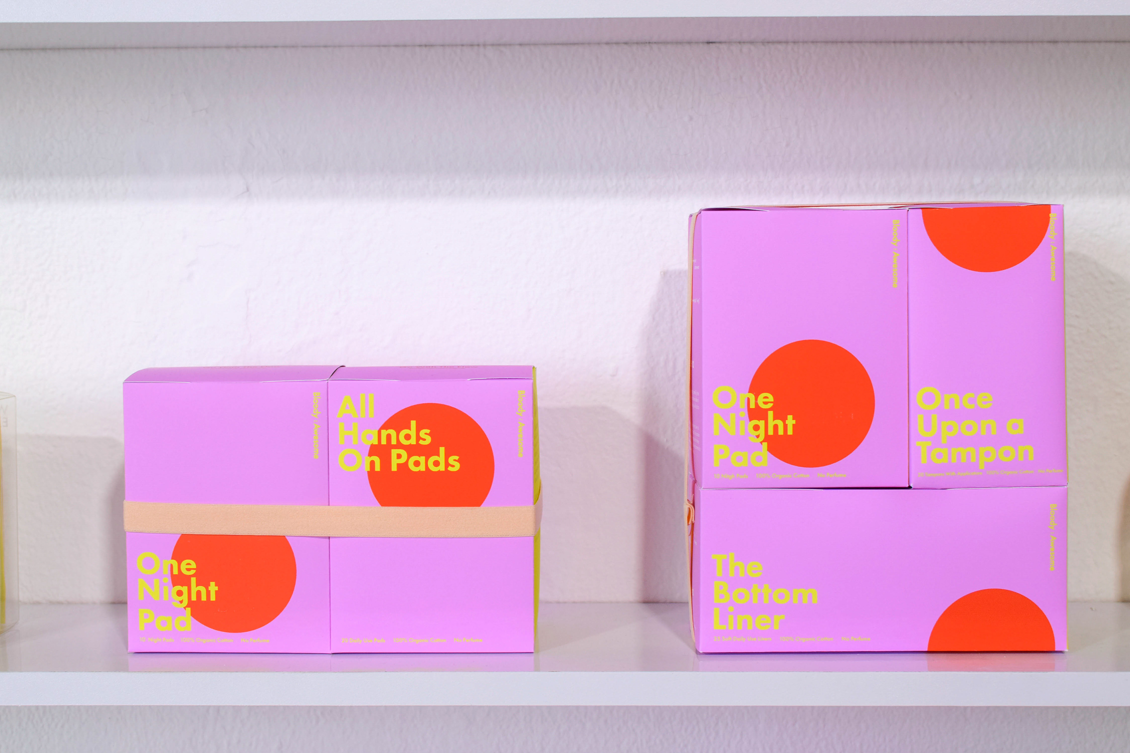
בנוסף יצרתי מארזים שמטרתם היא הרחבה של המותג ויצירת ערך מוסף. המארזים מבוססים על דפוסי שימוש קיימים. כשהן מתחילות להשתמש במוצר חדש או נחשפות למוצר חדש הן לא כל כך יודעות באיזה מוצרים נוספים עליהן להשתמש. המארזים עוזרים בכך שהנערות לא צריכות לחשוב יותר מידי, וכך הן יכולות לקבל את התשובות על המדף.
In products that are used internally, I have added an element of transparency. From my conversations with girls, I realized that they were very intimidated by this kind of products and it was necessary to show them the product in its natural form and size, and not just as a small illustration on top of the packaging.
The top of each packaging has a representation of the level of absorption. On the one hand, it was important for me to address the fact that it was indeed flow, not tiny droplets, and on the other hand, make the subject pleasant with a wink of humor through copywriting.
I also created kits aimed at expanding the brand and creating added value. The kits are based on existing usage patterns. When they start using a new product or are exposed to a new product, they do not really know what other products they need to use. The kits make the girls not having to think too much, so they can get the answers on the shelf.
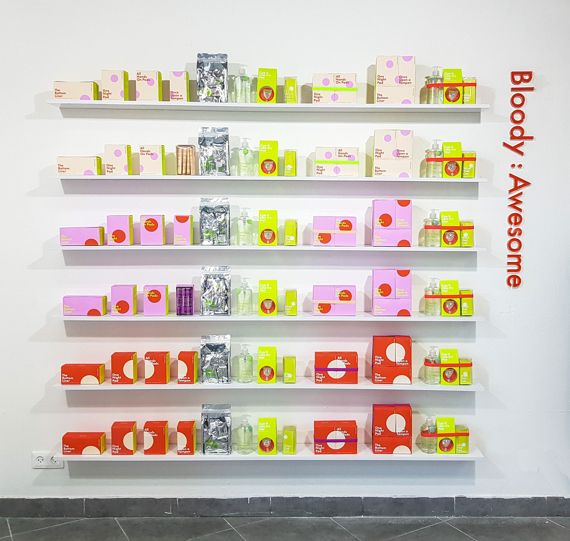
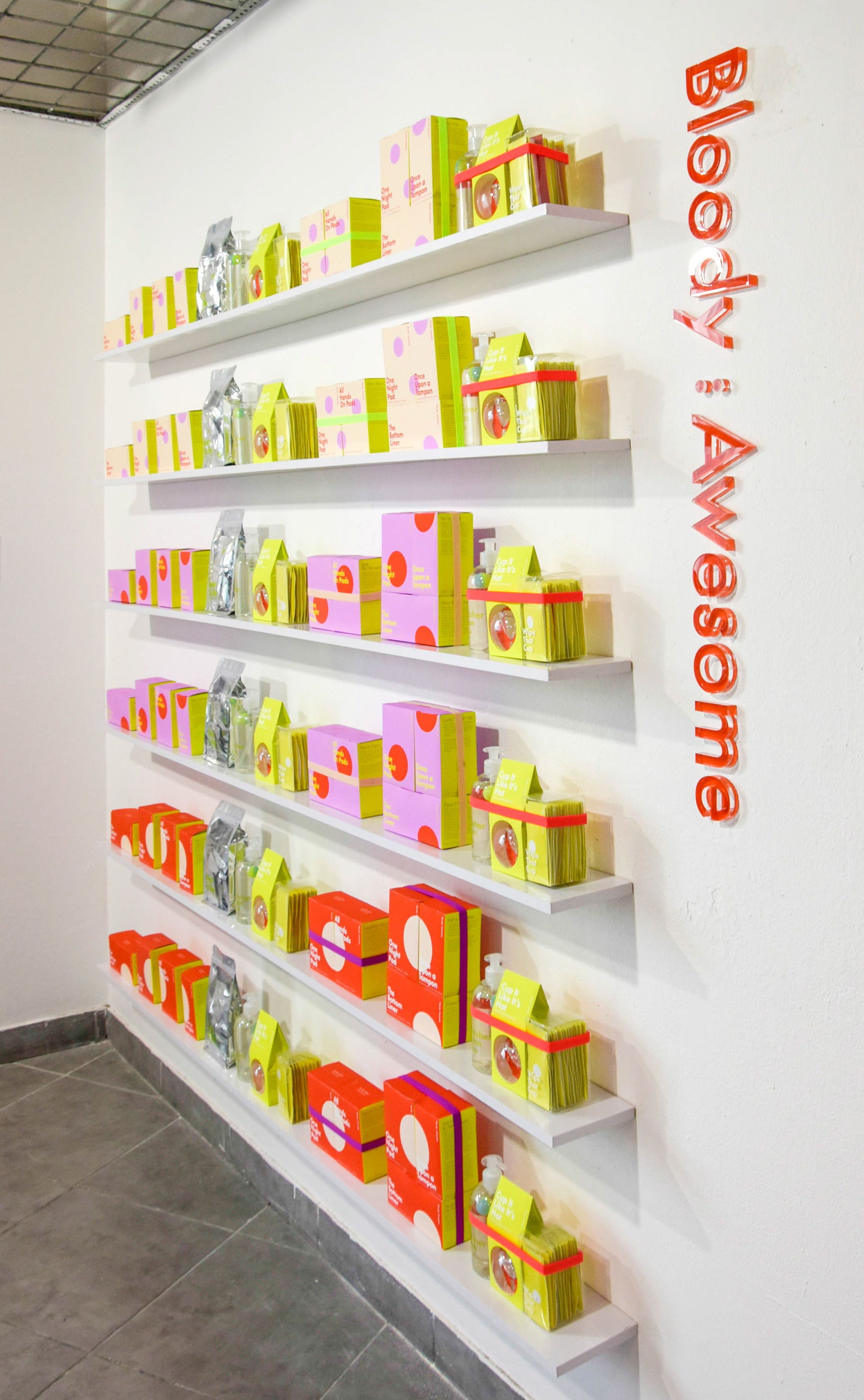
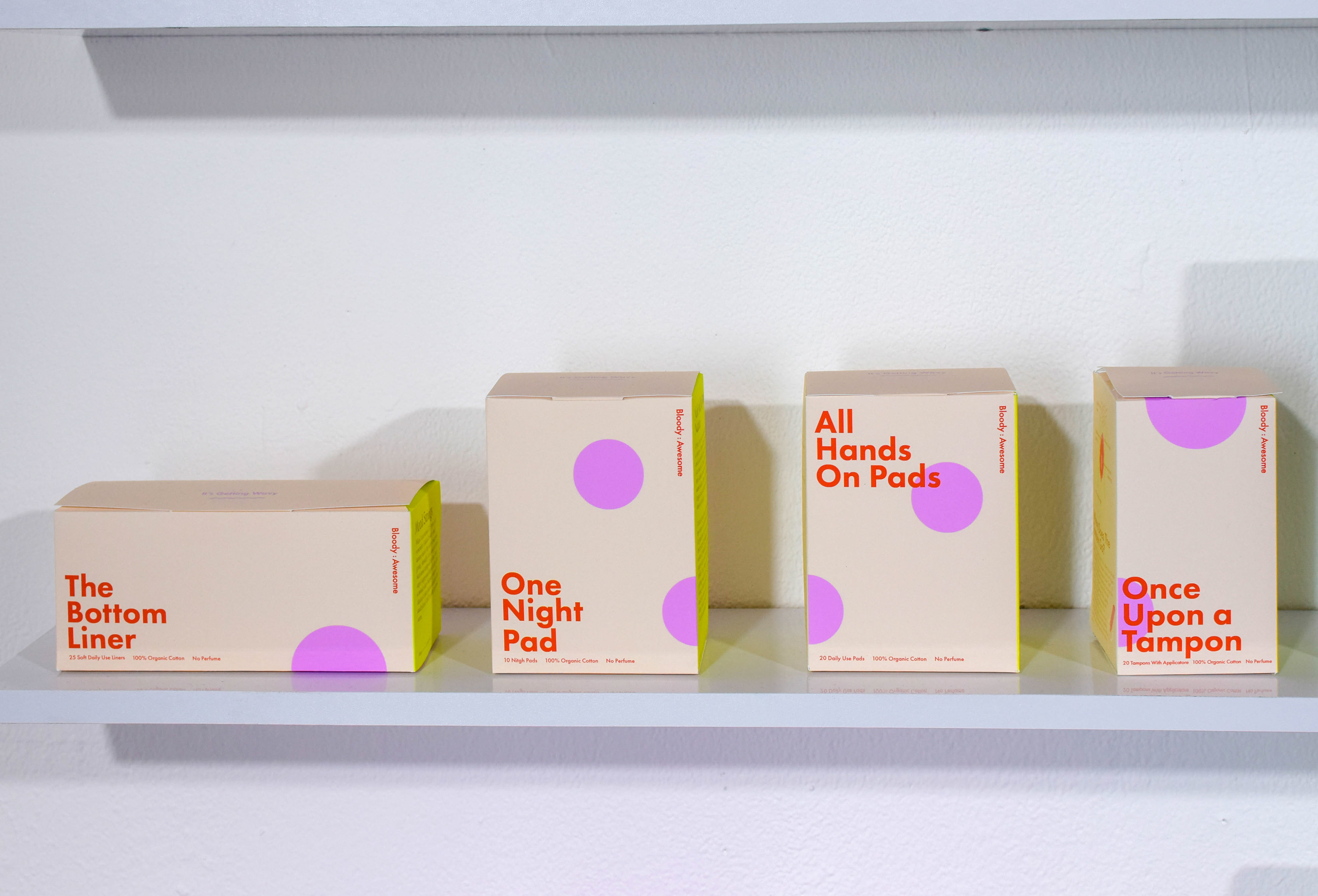
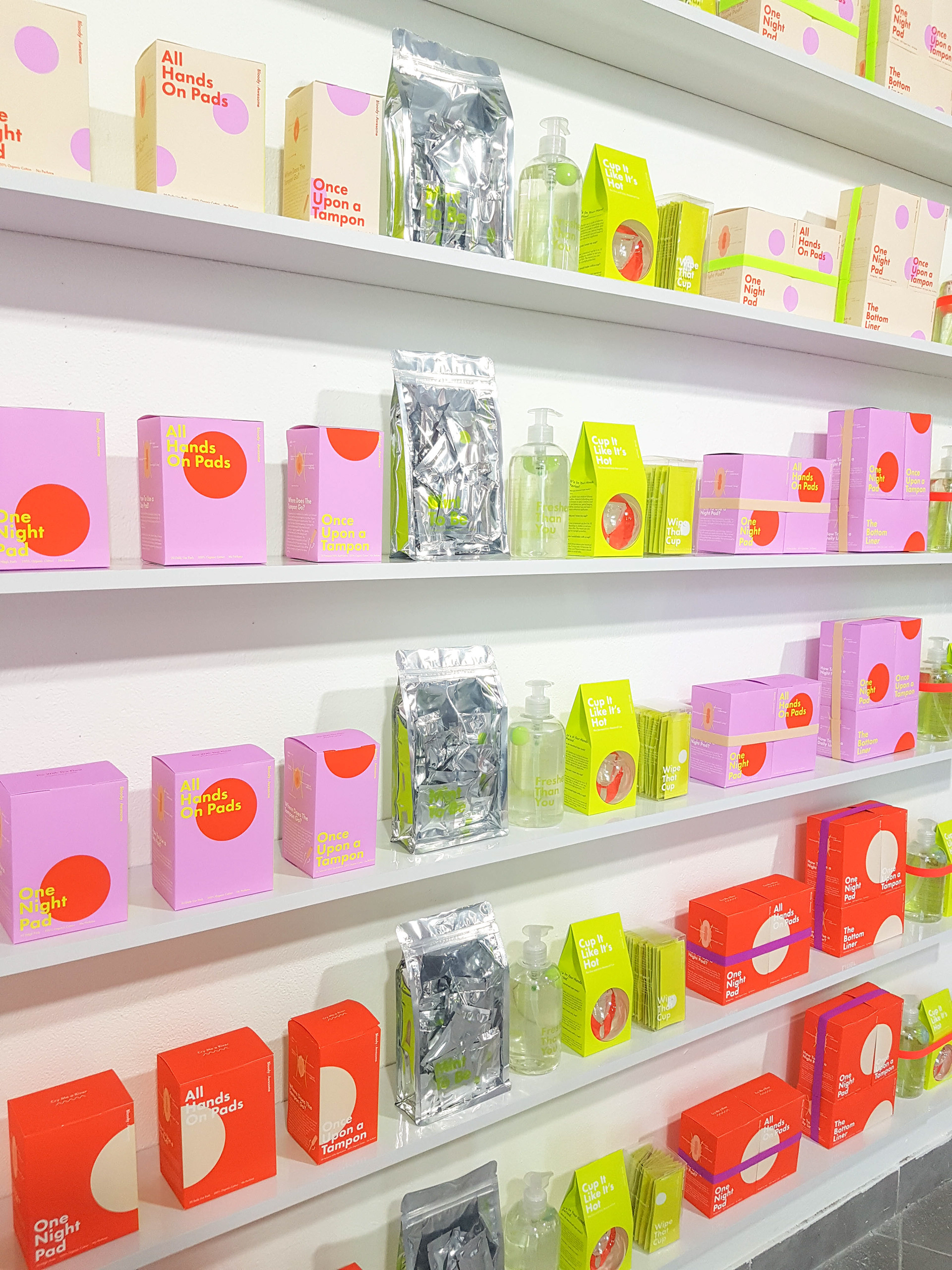
התמונה הרחבה- חוויית המשתמש האנלוגית -התמצאות על המדף
מדובר במוצרים שמופיעים במסה יחסית גדולה בסופרים ורשתות הפארם, והיה לי חשוב לייצר סיסטמה ברורה ונוחה להתמצאות ביניהם. על כל מוצר השם מופיע באופן בולט, והצבע של כל אריזה מתייחס לרמת הספיגה. גם כאן הייתה חשיבות ליצור הבדלה מבלי להציג רמת ספיגה כזו או אחרת כקשה או קלה יותר, זה לא משנה אם הדימום מתבטא בהמון כתמים קטנים, או כתם אחד גדול יותר, ועל כן ייצוג העיגולים על גבי האריזות.
המטרה העיקרית בפרויקט שלי הייתה להצליח לתווך את הנושא הכל כך טעון הזה, בצורה מחבקת, הומוריסטית וקלילה, מבלי להתפשר על האינפורמטיביות שכל כך נחוצה להן. מעין כיווץ של כל מה שהן צריכות ומחפשות, לקופסא אחת.
The broader image- the "user experience" -Orientation on the shelf.
These products appear in a relatively large mass in grocery stores and the pharma networks, and it was important to me to produce a clear system to get around them. On each product, the name appears prominently, and the color of each packaging refers to the absorption level. It was important to me to create a distinction without presenting one level of absorption or another as more difficult or easier, It doesn't matter if the bleeding manifests itself in a lot of small spots or one bigger stain, and therefore the representation of the circles on the packages.
The main goal of my project was to be able to mediate this so charged subject in a humorously, embracing way, without compromising the informativeness these girls need. everything they need and look for, in one box.