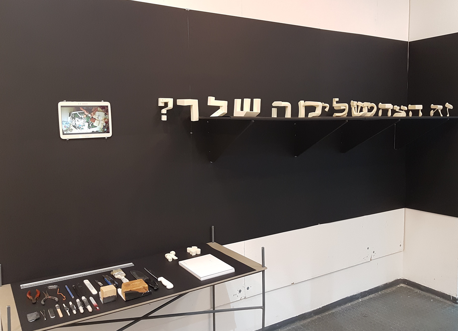
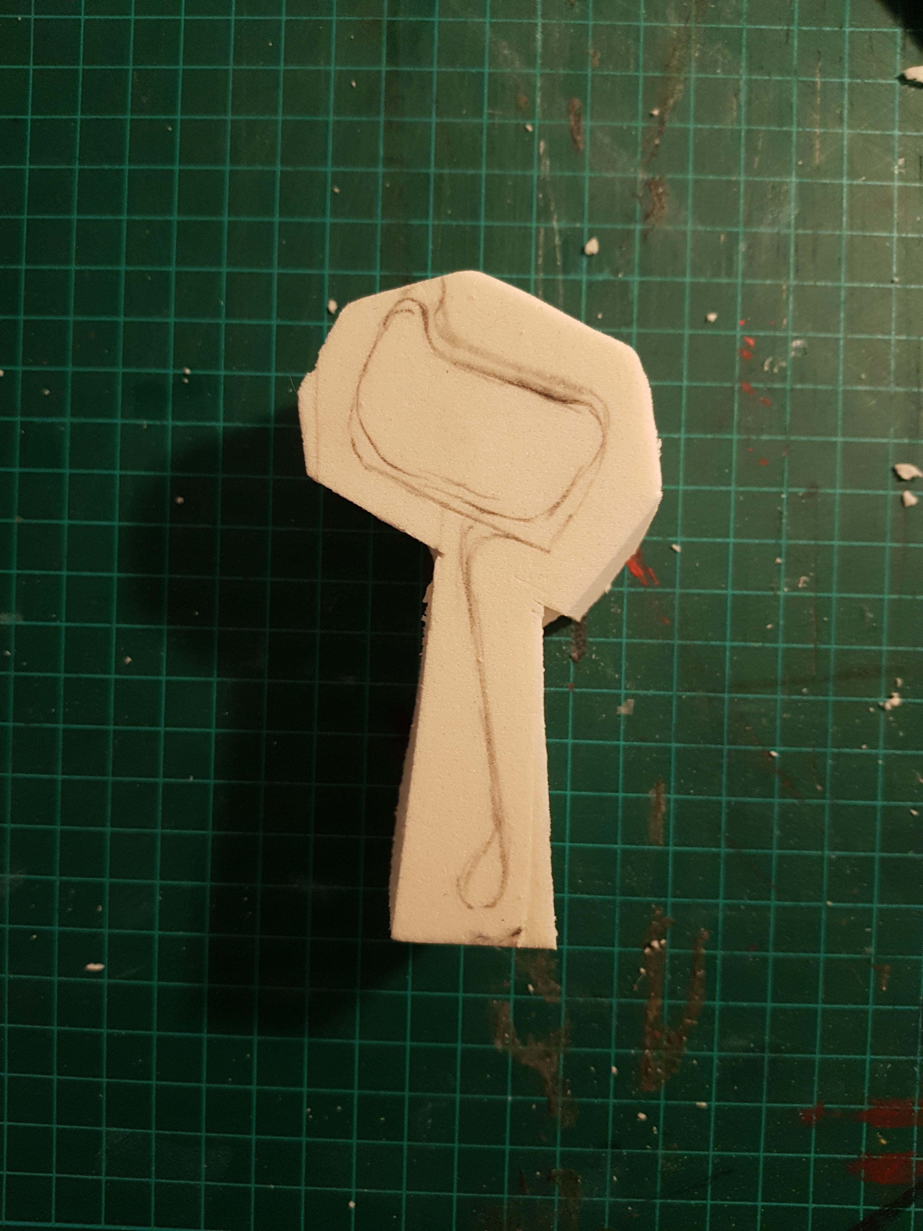
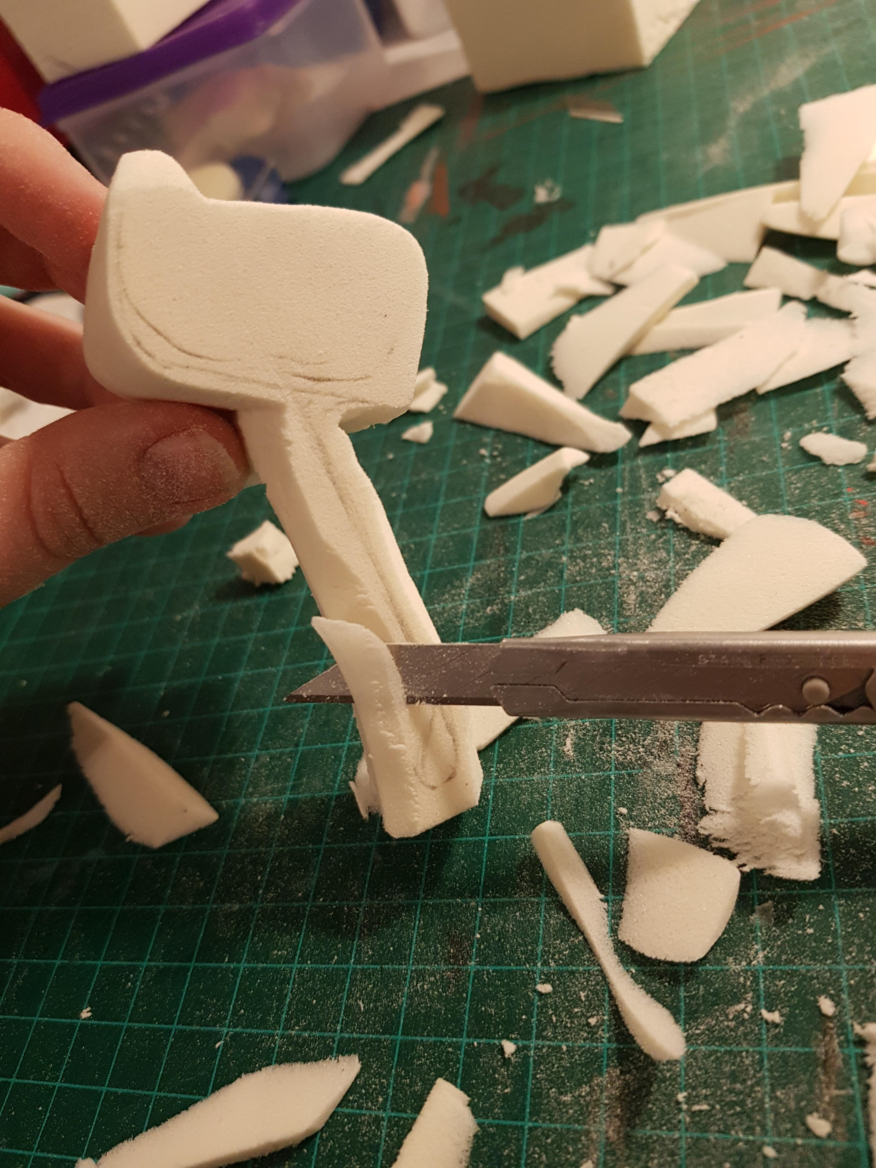
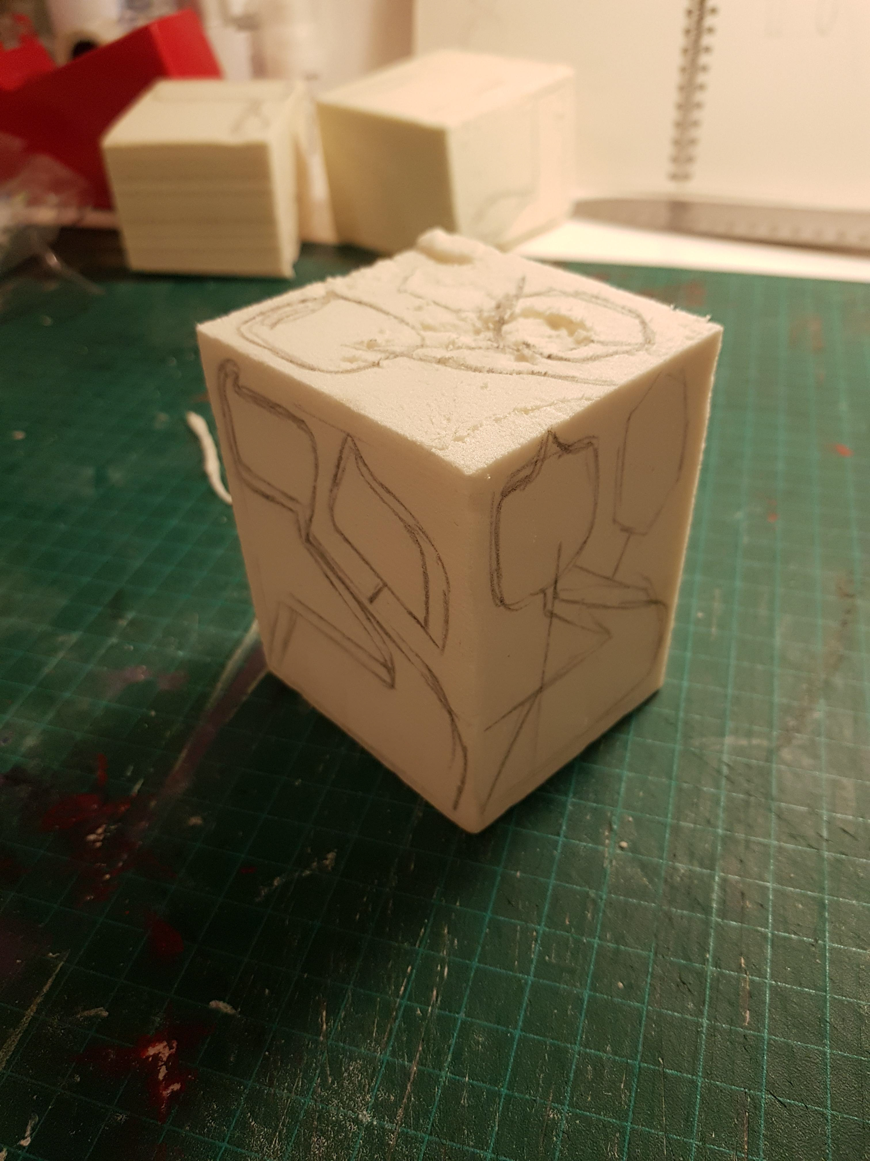
The experiment arose after looking at three-dimensional billboards. All the letters looked as if a long tube of the same letter had been cut off - completely ignoring the font's character. The experiment examined whether the Hebrew letter can be readable and understandable, without giving up the character of the font in which it is written.
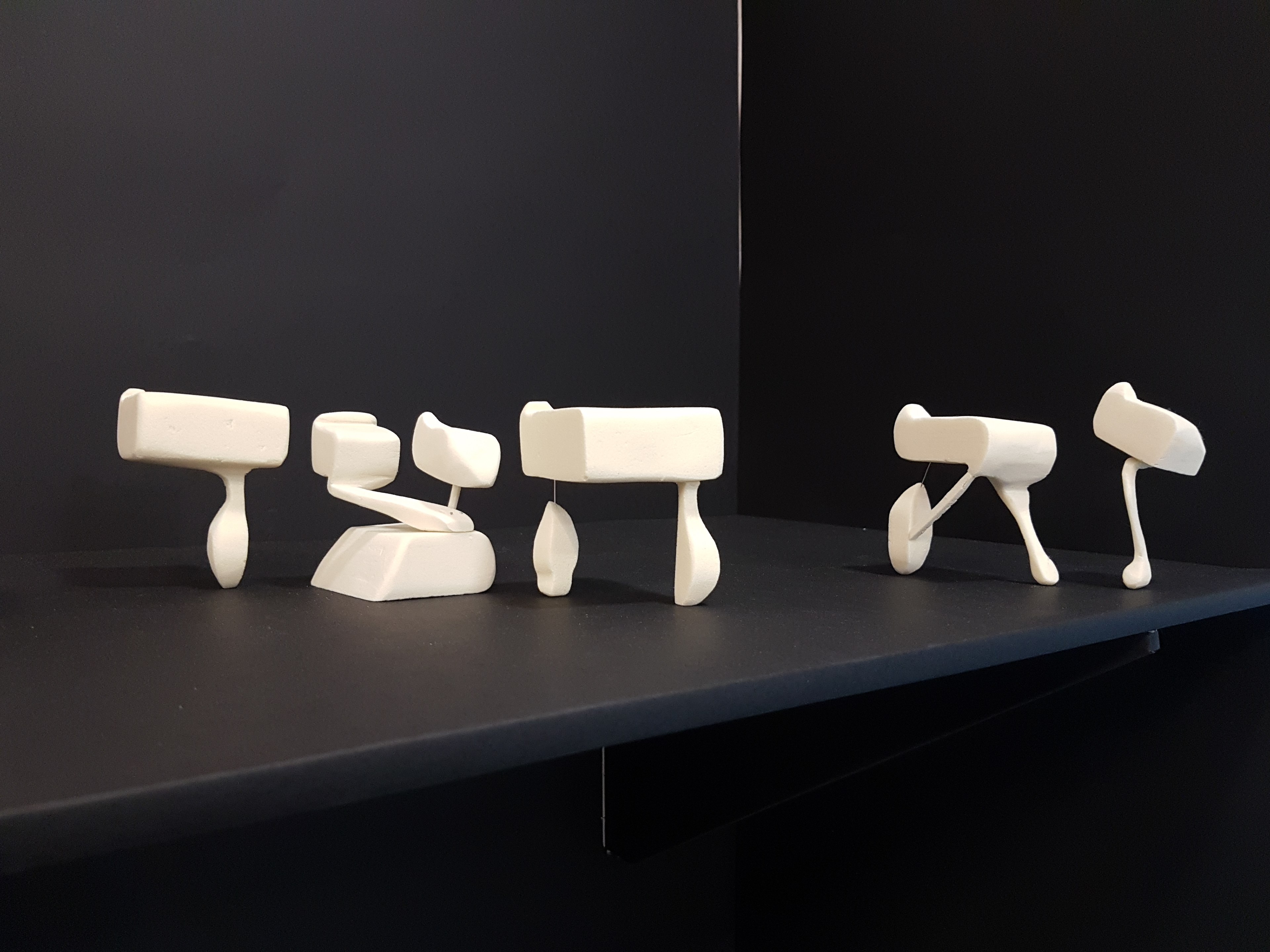
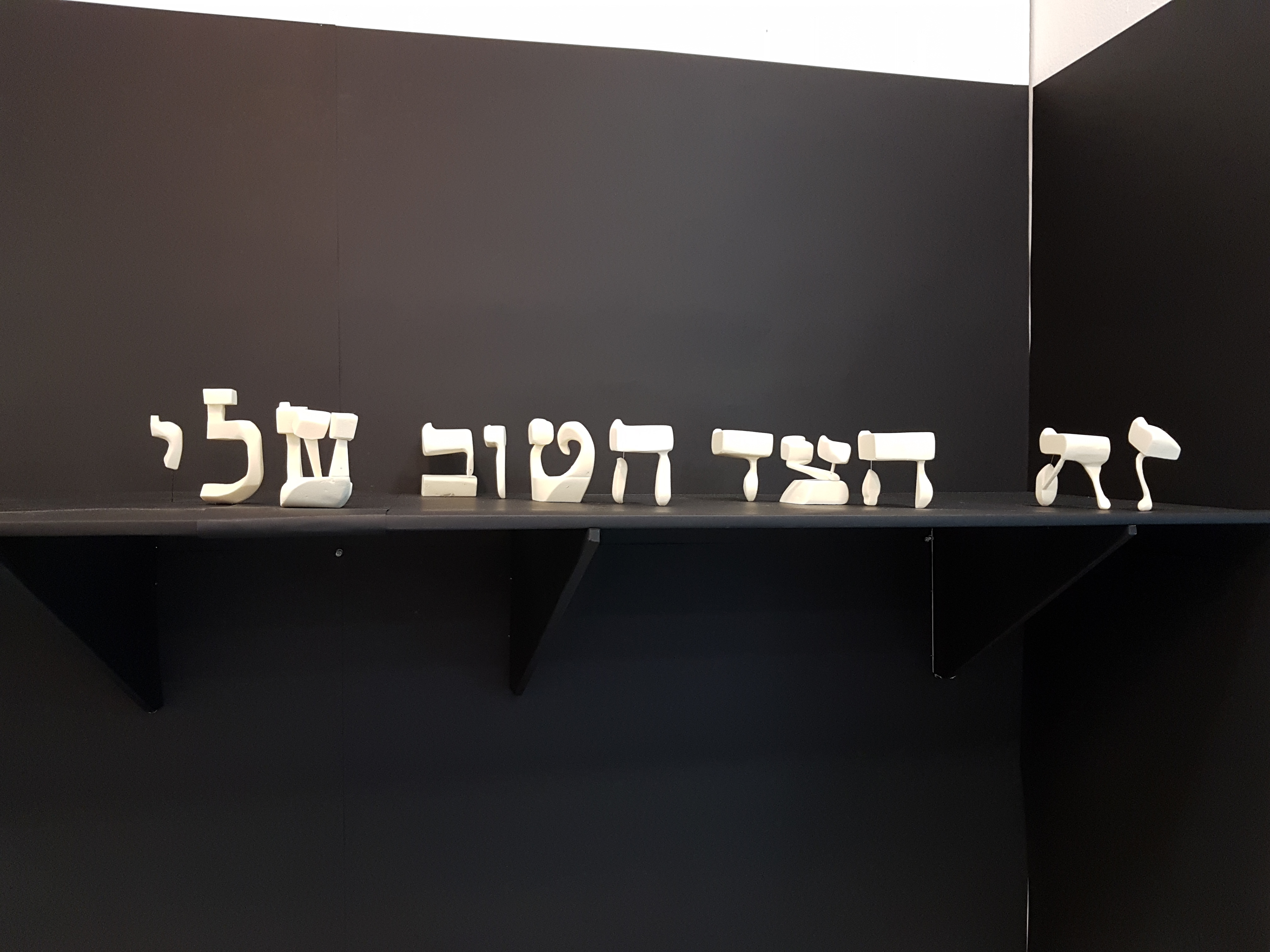
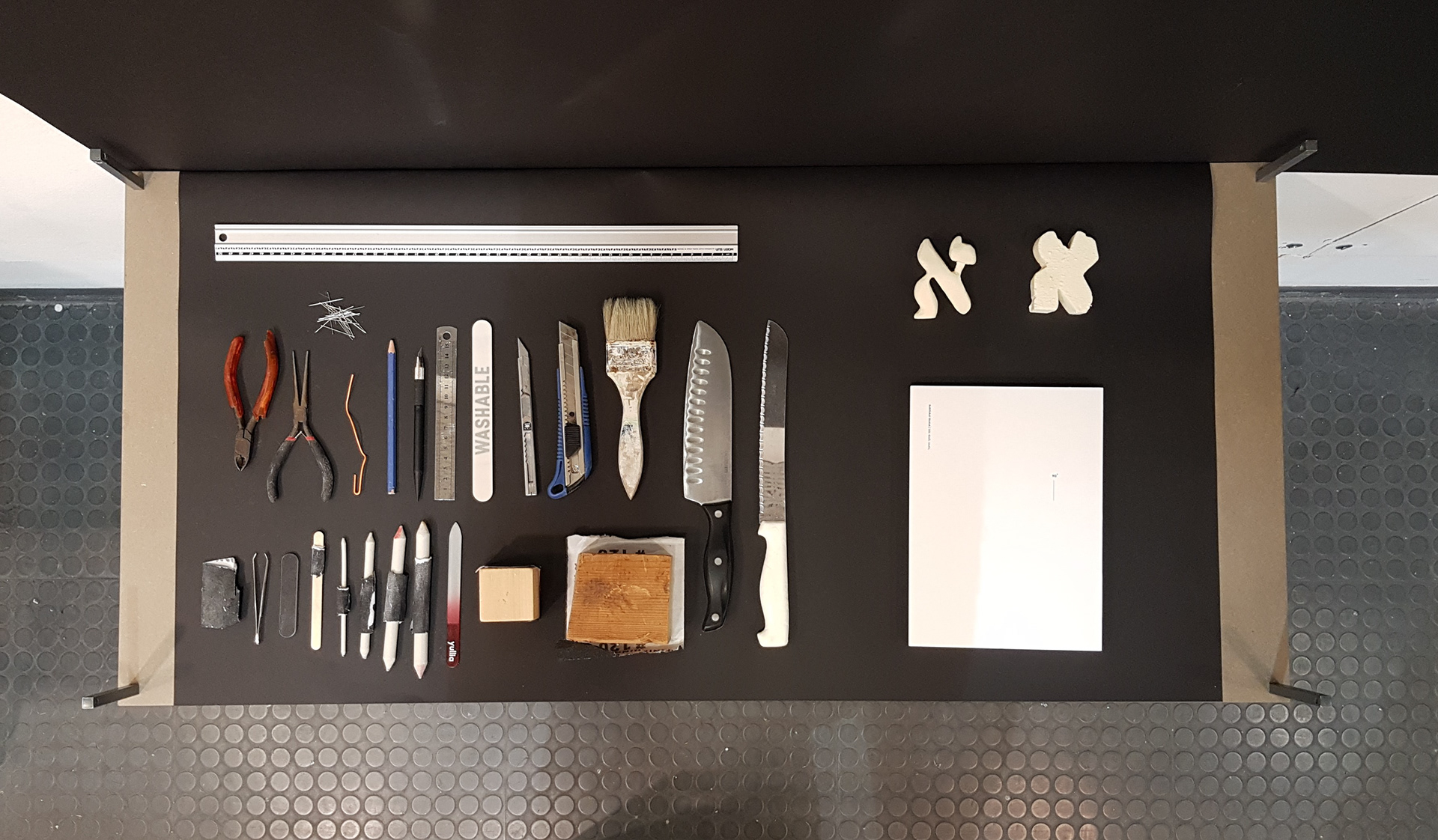
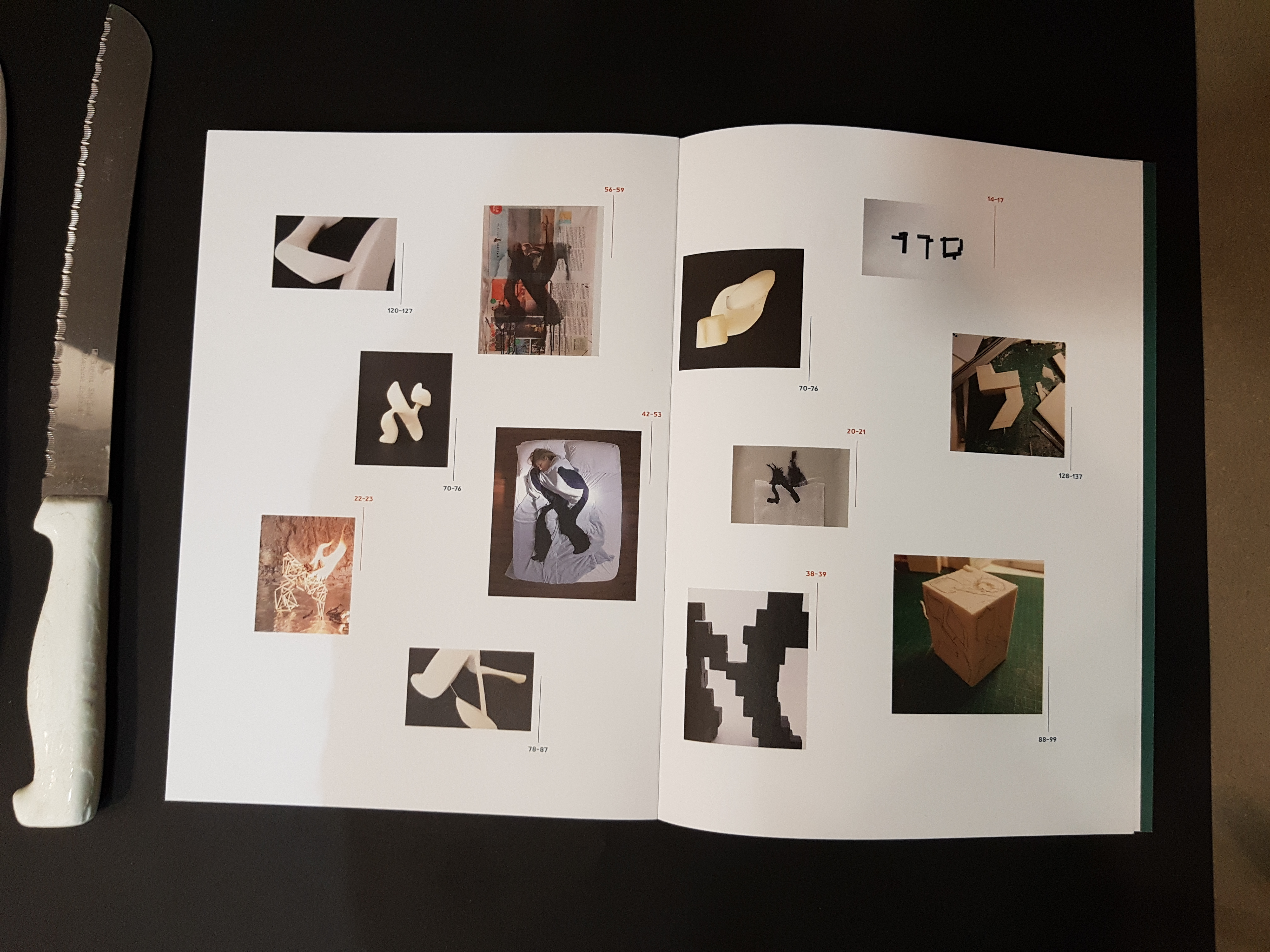
The experiment examined six different fonts that eventually assembled a sentence, accompanied by a filmed video of the carving and shaping of the letters, the tools used for it, and a book describing the process - from the first part of rapid typographic exponents that formed the basis for the final research question, to comprehensive documentation of the letter creating process combined with thoughts, insights and conclusions from the work process.
הפרויקט נולד בקורס טיפוגרפיה ניסיונית, ומתוך הסתכלות על שלטים תלת ממדיים של חנויות. כל האותיות בשלטים נראו כאילו נפרסו מתוך צינור באותה האות, בהתעלמות מוחלטת מאופי הפונט המרכיב את האות.
הניסוי בודק האם האות העברית יכולה להיות קריאה מבלי לוותר על האופי של הגופן בו היא נכתבת, גם מזווית צדדית של 90°. הניסוי בודק שישה סוגים שונים של פונטים המרכיבים משפט, מלווים בסרטון קצר המתאר הילוך מהיר של הטכניקה בהן נוצרו האותיות, הכלים בהם השתמשתי להכנת המודלים, וספר המתאר את התהליך בפרויקט ואת הניסויים שקדמו לו.